New Look, Same Trade Me Feel

Staff Reporter
23 May 2025, 4:00 AM
 Familiar platform, refreshed design rolls out
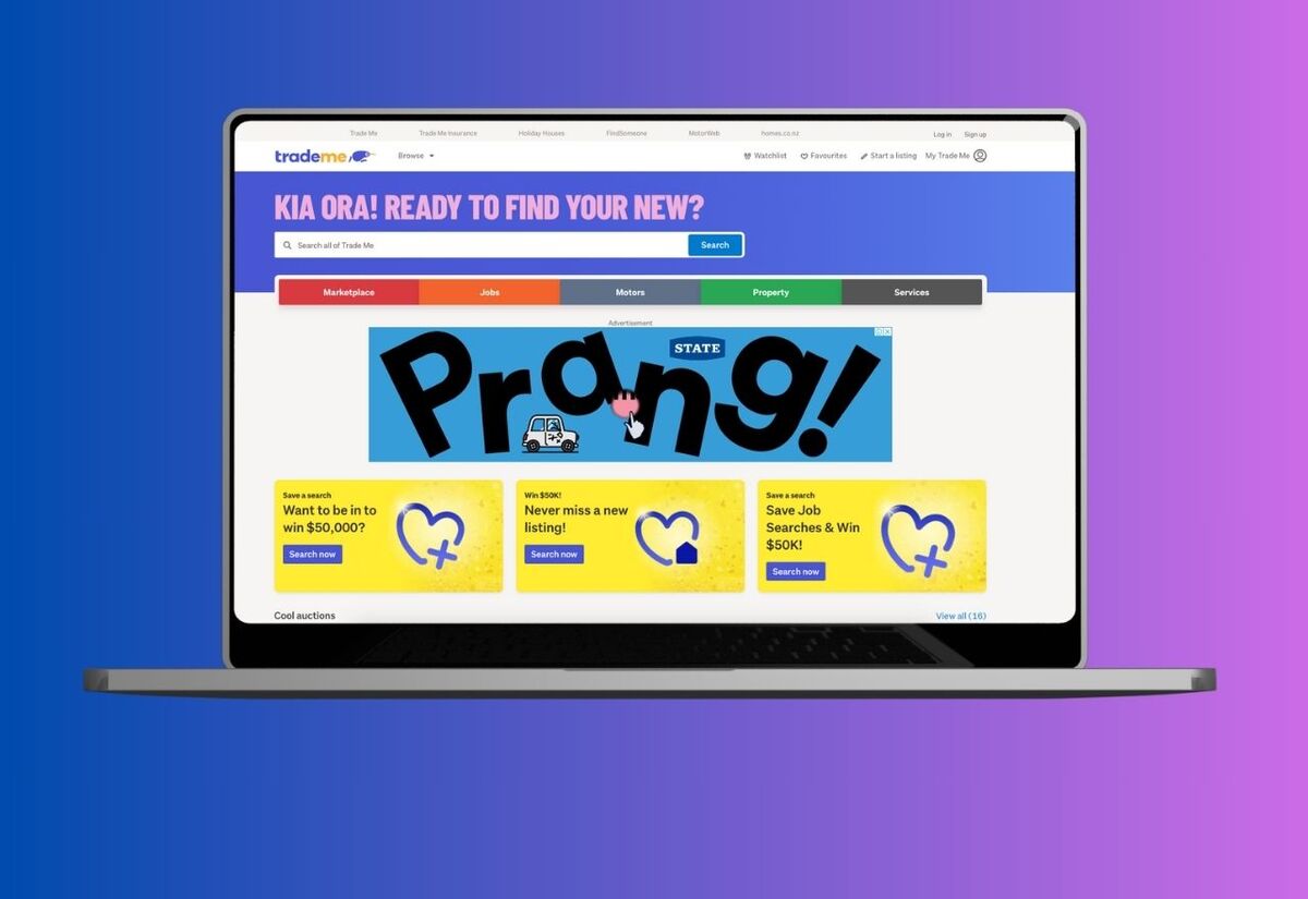
Trade Me’s had a bit of a glow-up—and Coasties might spot the changes next time they hop on to buy, sell, or just have a nosey.
The company is rolling out a fresh new look across its website and apps.
Think updated logos, a modernised homepage, and a cleaner, simpler design.
It’s all about making things feel consistent, trustworthy, and easy to use—without losing the feel-good familiarity that’s made Trade Me a Kiwi staple for years.
Behind the scenes, Trade Me’s team has been digging into how New Zealanders interact with the platform, with the goal of creating a more unified experience.
Some bits—like the app icons—are already live, while other tweaks will roll out over the coming weeks.
So, what’s different?
- A sleeker logo and design now appear across the site
- The app icons have had a refresh on both iOS and Android
- Desktop users will now find the “Log out” button down the bottom of the page
- “Browse” is now called “Categories” and
- The “Stores” section has moved under “Marketplace”
For Coasties that rely on Trade Me to hunt for bargains, shift furniture, or offload kids' gear, the refresh is a welcome change.
It keeps the platform feeling fresh and easy to navigate without changing the way we use it.
It’s not a dramatic overhaul—just a tidy-up that makes things feel smoother, easier, and more trustworthy when you’re browsing or buying.
And with so many local buyers and sellers using the site daily, these small tweaks are likely to make a big difference across the Coast too.
Know something local worth sharing?
Send it to [email protected] — we’ll help spread the word.